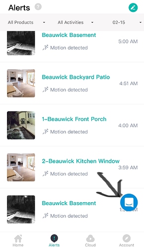
I really hate the way the new KAMI tech-support help button obscures the timestamp in the lower right hand corner when viewing motion alerts.
Since I usually review motion alerts oldest to newest, the alert I want to review is always the one that is obscured if I have more than four events. Why not add the new button at the bottom where the other buttons are located? There’s plenty of room there. Come on guys! Is anyone working in quality control there?
Just my own personal thoughts here but what is preventing you just slightly scrolling up or down? To question Yi/Kami quality control for this factor is rather unfair and unjust. What they have tried to do is make it easier for people to get help and access to support via the Kami help button.
Your suggestion of moving it to the bottom toolbar would in my opinion create a very busy and congested toolbar.
I have no concern with your thought here but questioning the quality control aspect is unfair.
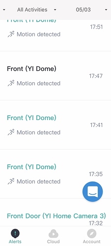
On the screen grab I have presented you can easily see the timings of the most recent five alerts.
Hey @Peter Thanks for bringing this to our attention. We are discussing internally the best option for our chat button. The most important goal of the chat button is to quickly & easily address and questions or troubleshooting questions that may come up.
Your feedback is greatly appreciated. We do our absolute best to address all our customer needs and find a solution that can benefit all.
Thank you for the screenshot, very helpful. @YorkshireUser Has a wonderful suggestion as to help mitigate the view obscurity with a simple scroll.
Have a wonderful day! Thanks for coming to the community


